← Back to work
Case Study · 01 of 03
Sigma Squared
Outcomes Intelligence Platform · B2B Enterprise Analytics
Case Study · 01 of 03
Outcomes Intelligence Platform · B2B Enterprise Analytics
The Company
Sigma Squared is an Outcomes Intelligence Engine. Its ML models train on an organization's historical data to identify patterns of success for any outcome metric — then score individual decisions against that model at the moment they're made. The co-founders are Roland Fryer, Harvard professor of economics, and Tanaya Devi, PhD Harvard labor economist. The science is rigorous, peer-reviewed, and legally defensible. The bias and disparity analytics have been validated by academics and the DOJ.
When I joined, the product had been deployed primarily as a consulting tool for DEI teams. The platform was an internal instrument for data scientists — not a product end users could navigate independently or adopt into their decision making. That had to change.
The Challenge
The original platform stacked multiple types of analysis on long-scroll pages across five lifecycle stages. Users had to know where to look, understand what the numbers meant, and know what to do about them — simultaneously. Most never converted from passive intelligence consumers into active decision-makers.
What users were experiencing
What the business needed
The Core Tension
"How do you make a controlled disparity feel like a decision, not a statistics lecture — without dumbing it down in a way that undermines the founders' scientific credibility?"
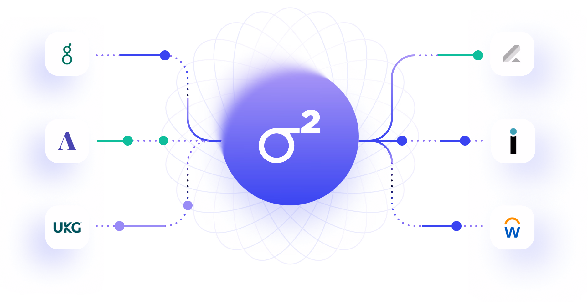
S2 moved from collecting flat files of data, to supporting live integrations to both pull and push analytics with the context of customer's historical data to back insights in workflows.
Design Decision 01
The original navigation imposed a mental model that required users to understand the full analytical framework before they could do anything useful. Long-scroll pages meant users could easily miss entire sections — and feel lost even when they found what they were looking for.
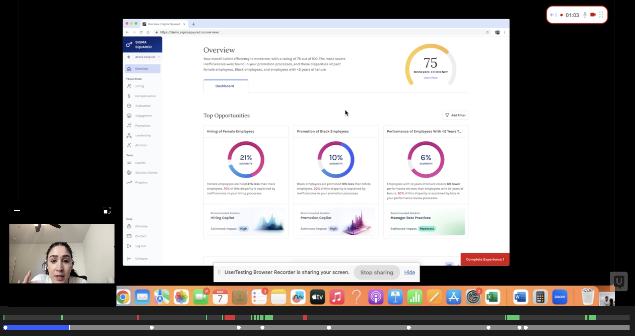
First, I replaced this with a new navigation and tabular IA so that analytical tools had their own space to experiment. Through extensive user testing we arrived at a two-zone page structure: cached "Largest Differences" surfaced at the top as a clear entry point, a filterable Deep Dive section below it, and remaining analysis broken into tabs. The complete picture fits on a single screen without scrolling. Tabs let users decide where to go without losing their place.
This redesign replaced the original prototype used to raise the seed round. It was tested across multiple rounds with current customers and senior HR leaders who weren't yet users — and we iterated until non-data scientists could navigate it independently.
UXR Interviews — moderated & unmoderated
Testing Details
Measured
Finding
100%
Successfully identified top insights
vs. 33% on original
82%
Accurately understood the problem
vs. 36% on original
4.8/5
Avg. ease of understanding
vs. 4.2 on original
73%
Preferred "bias" framing over "efficiency"
informed final terminology
The redesign
Original first draft of the product
Redesigned for UX and comprehension
Design Decision 02
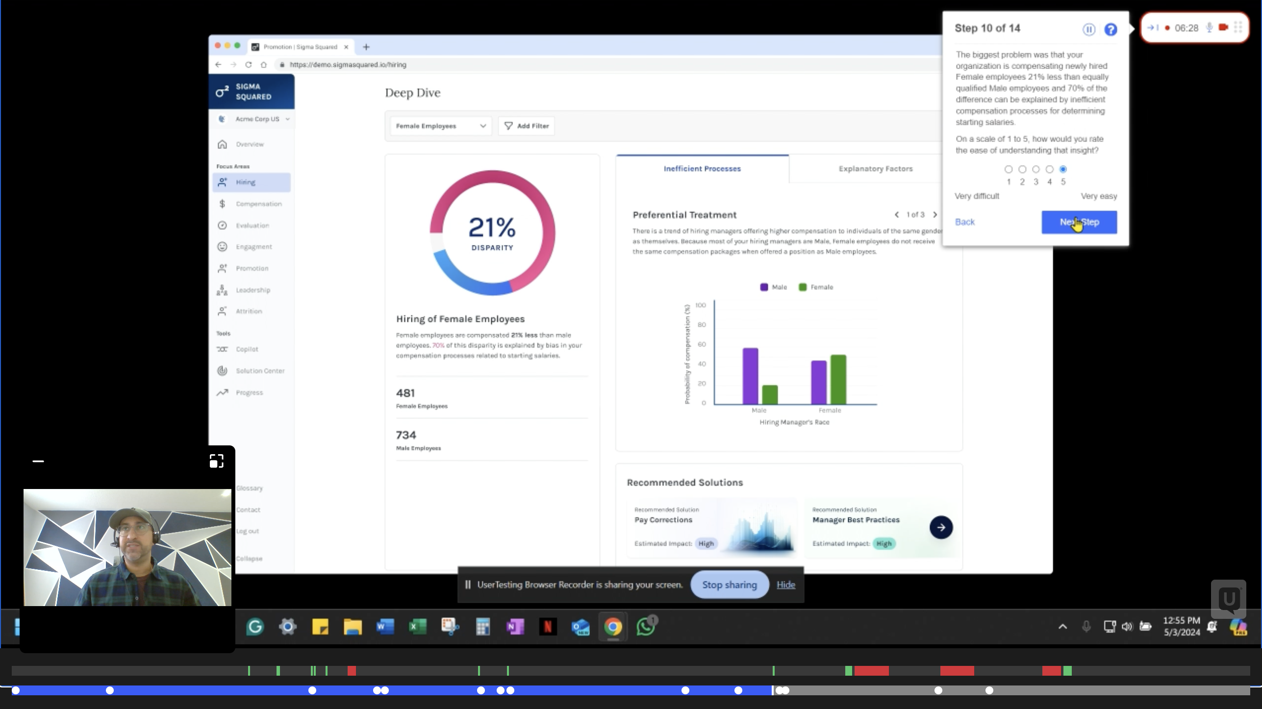
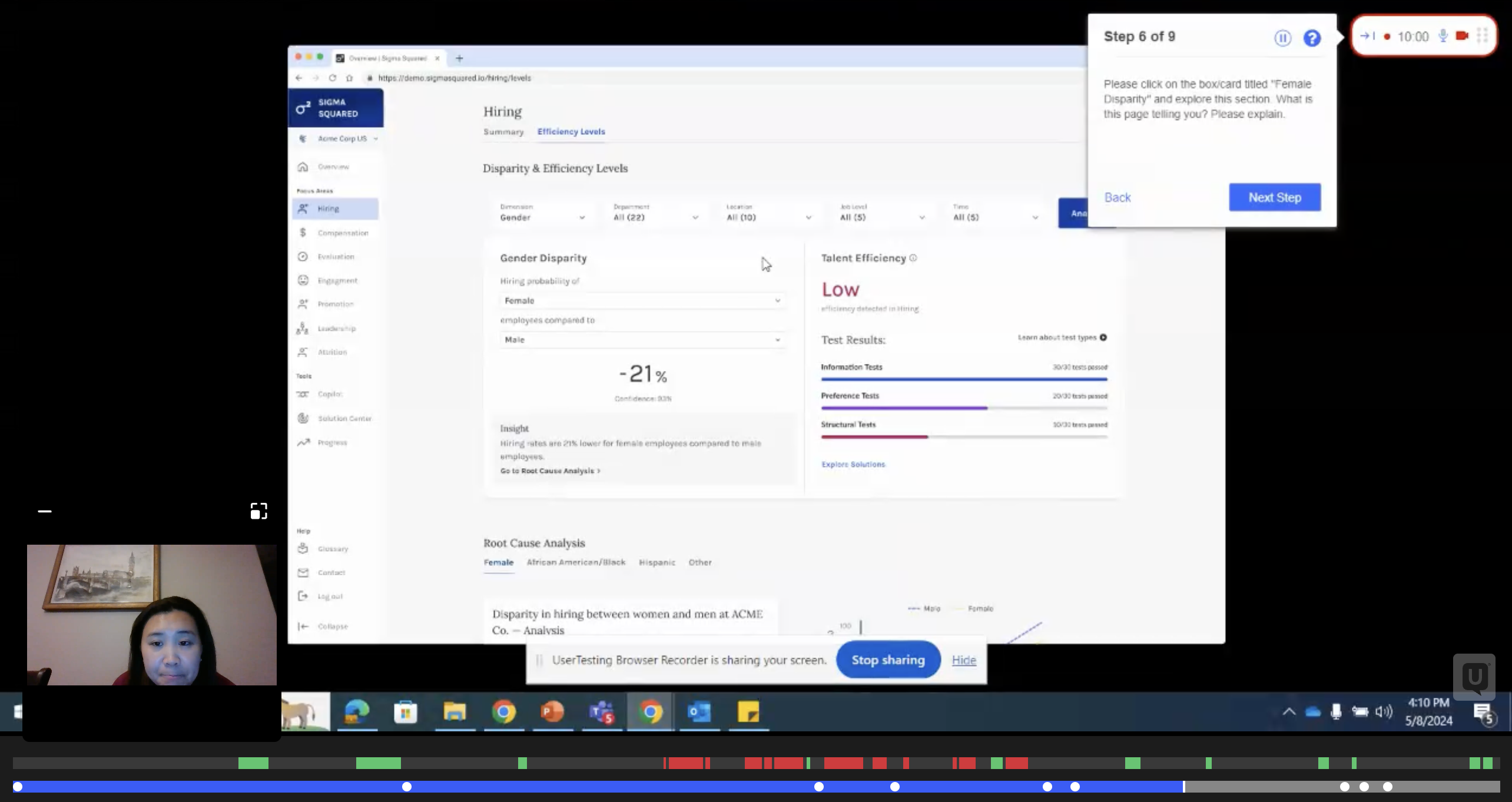
The original disparity view showed a pass/fail number. Users saw they'd failed a bias test and immediately asked: what test? What does it mean? Can I get a perfect score? The interface created questions faster than it answered them.
I redesigned the disparity display as a three-step narrative: Raw disparity → Controlled disparity → Bias-free. Each step builds understanding before the next is introduced. I watched this sequence click on a customer call — a non-data scientist following the story without needing it explained — and knew the sequencing was right.
What was added
Population size for context. Sentence-level interpretation. A new right panel for each bias test that failed — with title, visualization, and collapsible explanation. Video explanations for complex test types. A new "Explanatory Factors" section for root causes that don't constitute bias failures but still matter.
Why it matters beyond UX
This analytics layer is now used by enterprise HR leaders and law enforcement organizations to audit people decisions for systemic bias. It has been reviewed and validated by academics and the DOJ for accurately applying statistical methods previously only discussed in mathematical journals.
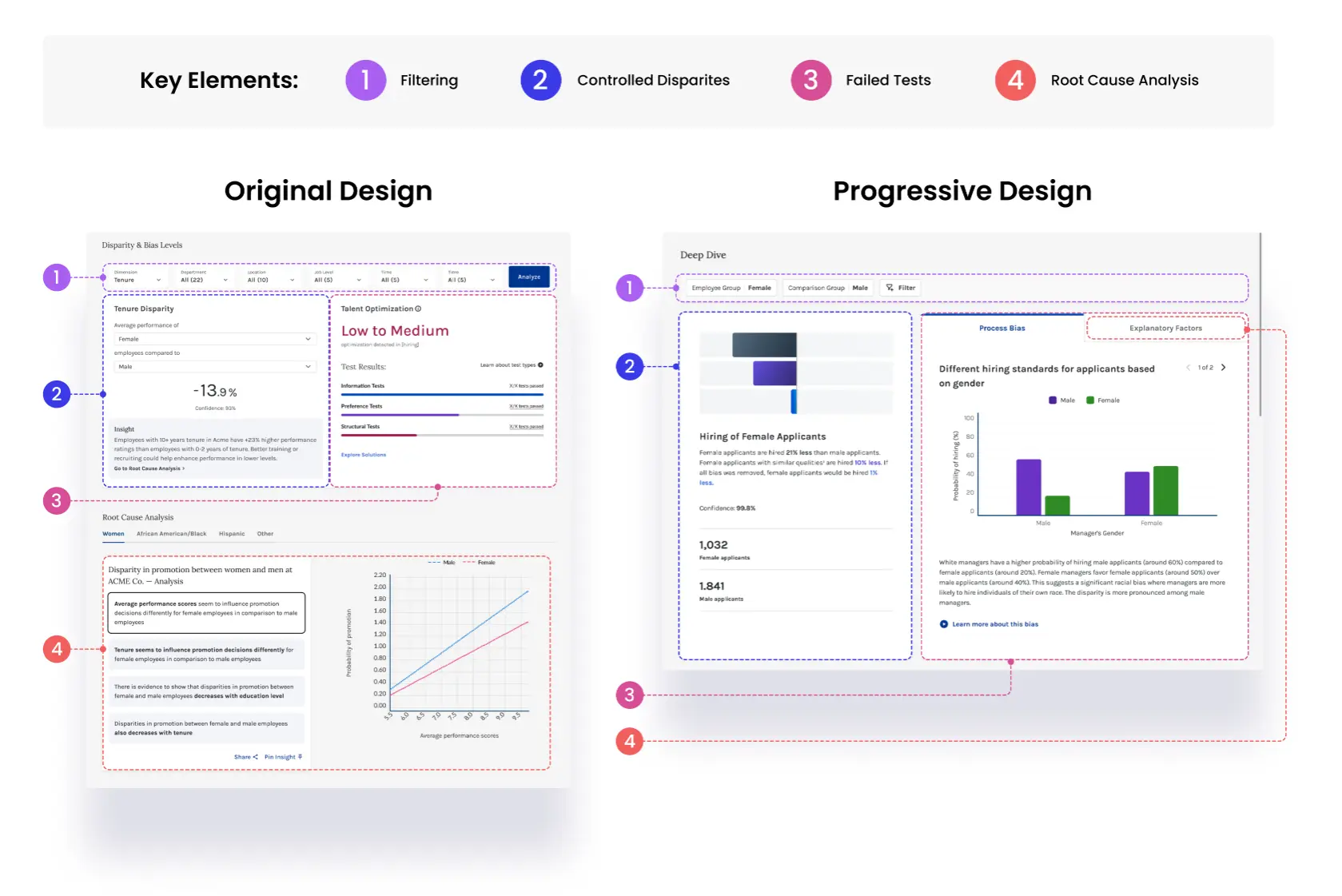
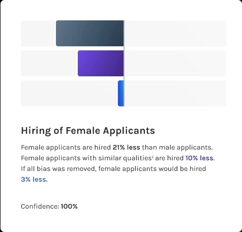
Raw, controlled, and bias-free
Each disparity number is shown three ways — the raw gap, the gap after controlling for qualifications, and the gap if all measurable bias was removed. This layering lets users understand how much of a disparity is explainable before jumping to action.
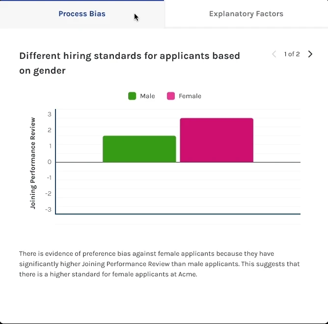
Process bias vs. explanatory factors
Failed bias tests are separated into two tabs: structural process failures and explanatory factors that don't constitute bias but still matter. Each test surfaces a plain-language title, a visualization, and a collapsible explanation — making the statistical output legible to HR leaders without a data science background.
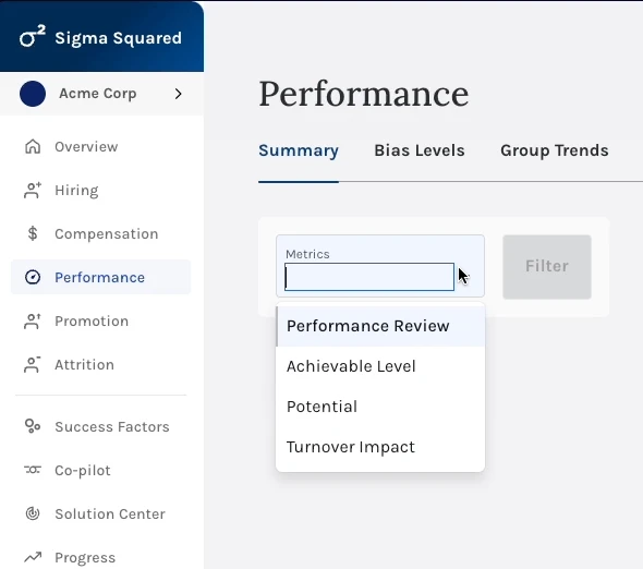
Metric-level filtering
Users can filter any focus area by specific outcome metrics — performance review score, promotion rate, attrition risk — so analysis stays relevant to the decision at hand rather than presenting every available data point at once.
Design Decision 03
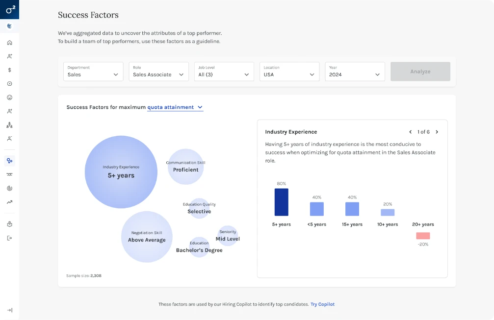
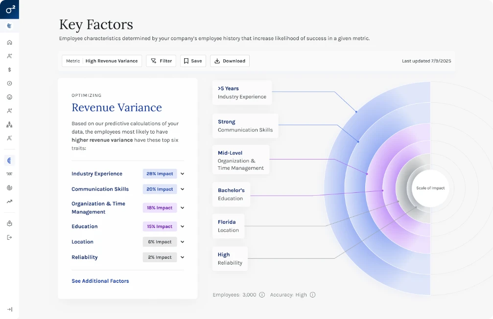
Key Factors didn't exist visually. The underlying ML models lived entirely in code — no interface, no visualization, no way for a non-data scientist to understand what the model was actually measuring or why.
Round one used bubble size to represent factor impact alongside a divergent bar chart showing level-by-level effects. It got the concept on screen but remained too complex for lay users — too much shown at once, with no clear hierarchy of attention.
Round two replaced bubbles with impact rings (also solving text-fitting constraints in deployment) and split the experience into two layers: impact rings with factor descriptions as the primary view, full-screen level breakdowns on click as the secondary view — with descriptive text and bottom-line recommendations about what each factor actually meant for the organization and what to do about it.
The Outcome
"Time to insight went from weeks or months — requiring an in-house data science team — to seconds. We saw approximately 50% fewer follow-up questions on Key Factors across sales and customer calls."
Before shipping Round 2, we ran a structured moderated test to determine which version — A (original) or B (redesigned) — better supported understanding, accuracy, content usefulness, and navigability. Each participant responded to one version first, then completed a preference test with both.
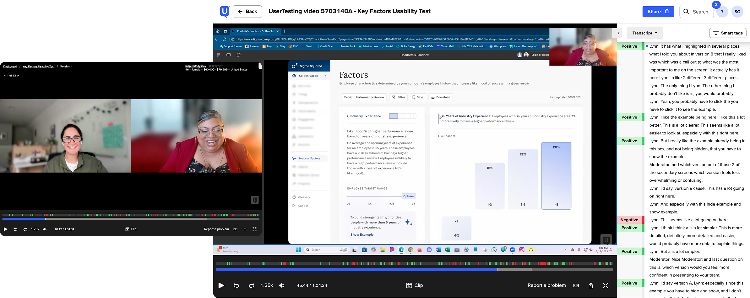
Test Setup
Measured
Summary of Results
From participants
"This makes my life easier and makes our recruitment decision easier — it will align to what works for us, and I'd say it with a level of excitement!" — Yumna
Design Decision 04
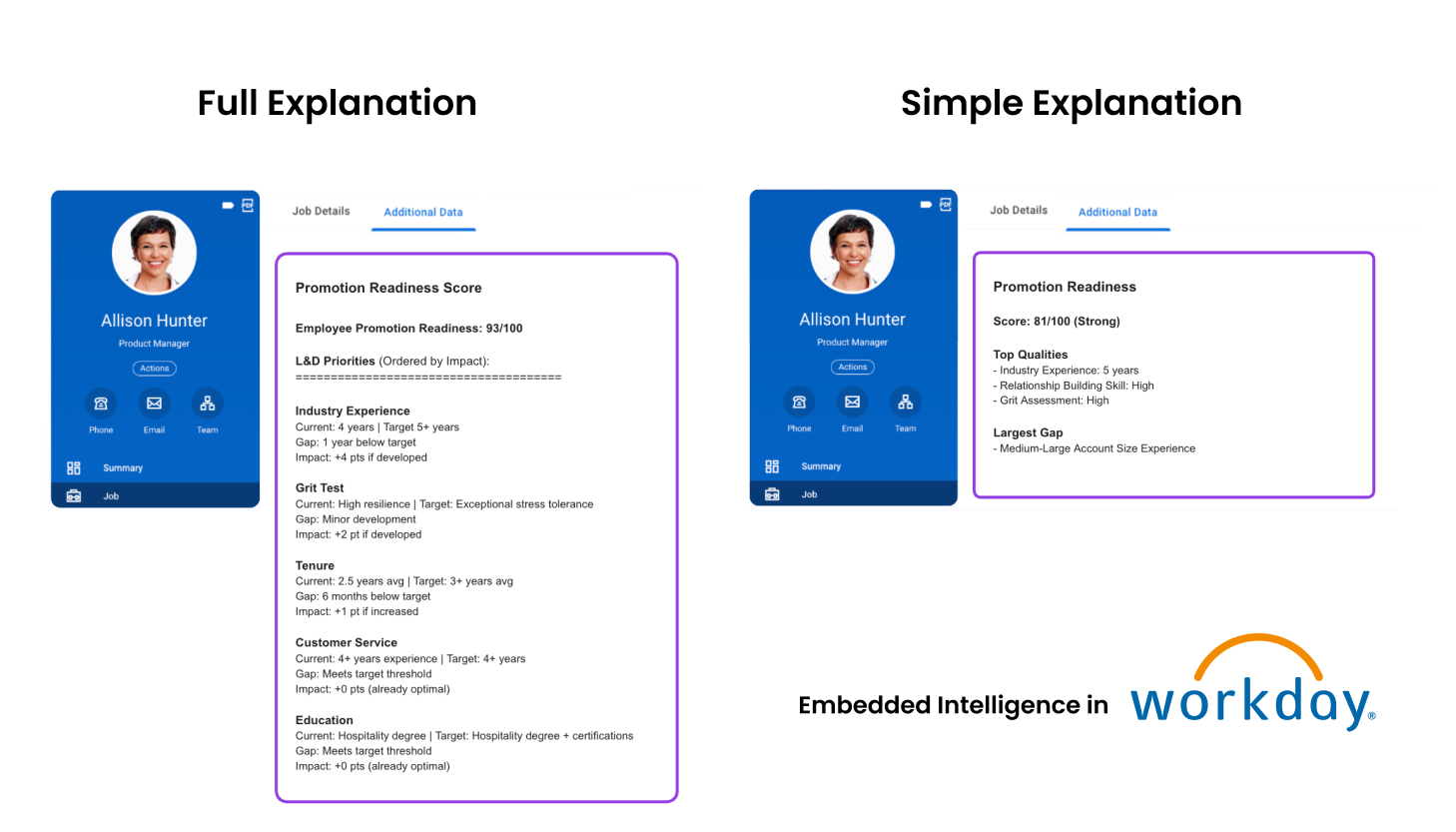
Every deployed model produces a score from 0–100 for each candidate or decision. Transparency required explanations — but the explanations had to write back into ATS and HRIS systems in whatever field formats those systems allowed. This is content design under real technical constraints.
The algorithm's accuracy comes from accounting for multiple paths to success — which makes explanations inherently unintuitive. Candidate A's target tenure might be 3 years. Candidate B's target might be 5 years for the same role. To a recruiter, that looks broken. It isn't — it's the model correctly weighting all factors for each unique individual. But that nuance kills adoption at the IC level.
Long-form explanation (Round 1)
Full breakdown by variables most impacting the score. Scannable and transparent. Right for some customers — too much friction for ICs who need to act quickly and confidently.
Simplified explanation (Round 2)
Customizable per organization. Narrows to Top Qualities and Flags — positive and negative factors in plain bullets. Unintuitive insights remain in the full view for transparency, but removed from the simplified view to reduce IC-level confusion at the moment of decision.
The Design Philosophy
"Don't dumb it down. Don't hide the science. Create two layers — one for the people who need to trust the system institutionally, one for the people who need to use it daily."
Outcomes
The Team