← Back to work
Case Study · 02 of 03
Electrify America
End-to-End EV Charging Ecosystem · Consumer & Enterprise
Case Study · 02 of 03
End-to-End EV Charging Ecosystem · Consumer & Enterprise
The Company
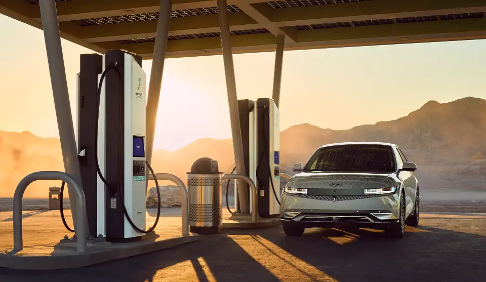
Electrify America was charged with creating a public fast-charging network across the US and Canada to reduce emissions — and deliver on a legal obligation. They came to our team after poor customer reviews had tanked their app and the charger experience. The problem wasn't visual. Nobody had mapped what a first-time EV driver actually needed to feel confident standing at a public charger for the first time.
These were new EV owners navigating a completely unfamiliar experience. Sometimes early adopters on road trips. Sometimes someone fresh from the dealership, home charger still getting installed. Sometimes apartment dwellers charging publicly as their primary method. They all shared the same anxiety: I've never done this before, and I need it to work.
Over the engagement I grew from Product Designer to Design Director, eventually owning the design system across every surface a driver touches — mobile app, physical charger interface, in-car experience, parking lot labels, home charger, fleet management tool, and white-label experiences for OEM partners.
The Research
Working closely with the research team, we conducted extensive field studies and built a full learning journey map across five stages: Background → Finding a charger → Arriving at the station → Charging → Post Charging. Each stage carried different emotional motivations.
The key insight: at the moment of charge, users' primary motivation is to minimize effort — not maximize value. Everything that was wrong with the original experience had been designed for the wrong goal. Marketing-minded design optimized for value communication at the exact moment users were most anxious and just needed it to work.
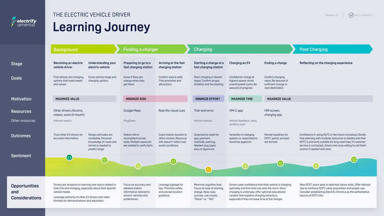
The research finding that reframed everything
"Findings emphasized that key information and next-step instructions need to be explicit and glanceable. Users don't see beyond their immediate view at the charger — or within their car."
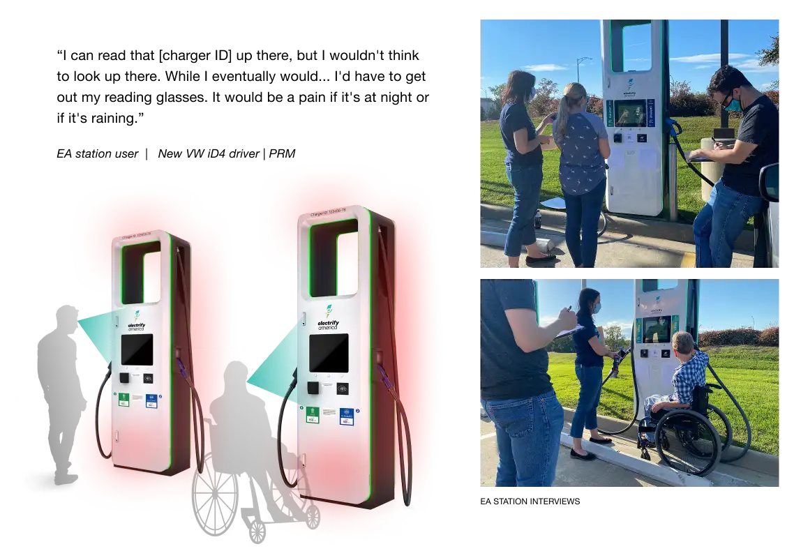
Research also revealed that CarPlay and Android Auto users couldn't see the Charger ID number at the top of the charger — a direct finding that led to relocating that element. Every design decision across the system flowed from the same principle: reduce friction at the exact moment someone needs to act.
Phase 01 · App Redesign
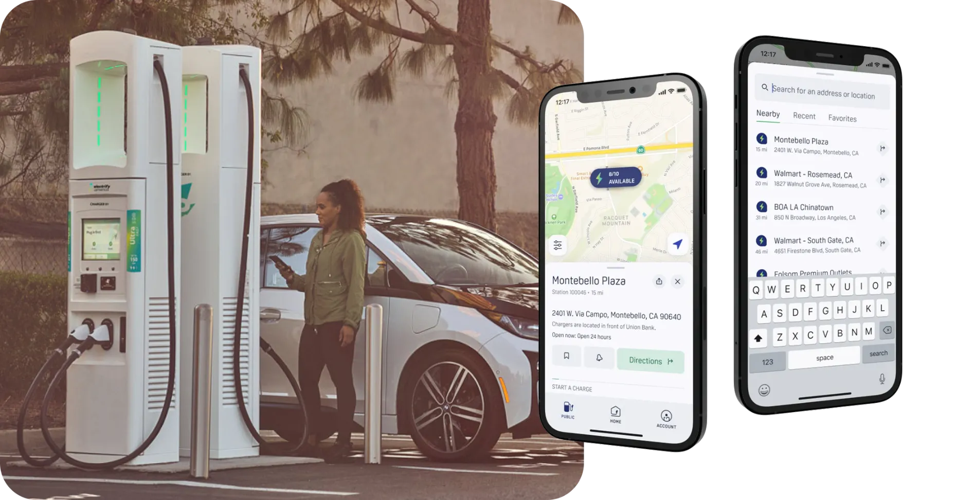
The first engagement: audit and redesign the iOS and Android apps toward UX best practices, with extensive user research and testing before a three-month launch deadline. We had a team of researchers, product designers, content designers, a project manager, and engineers. A large undertaking done fast.
The redesigned app allows drivers to find public charging stations, schedule home charging, track live session progress, pay contactlessly, and manage their charging history. The redesign addressed a multi-year backlog of user pain points surfaced through research.
Core features redesigned
Outcome
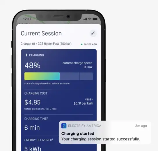
Charging Session
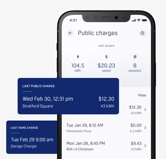
Charge History
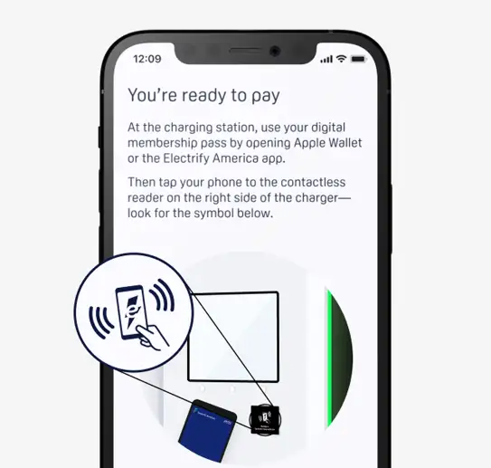
Contactless Payment
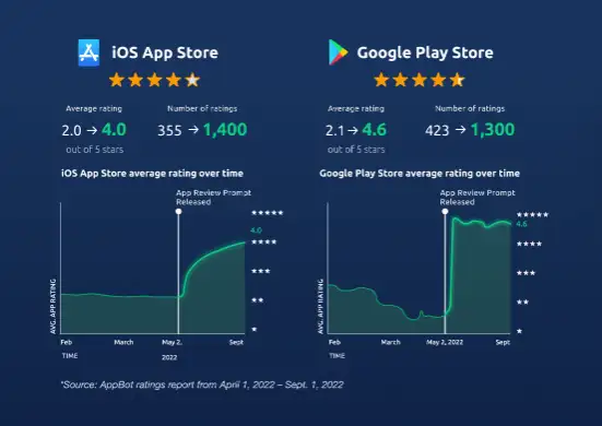
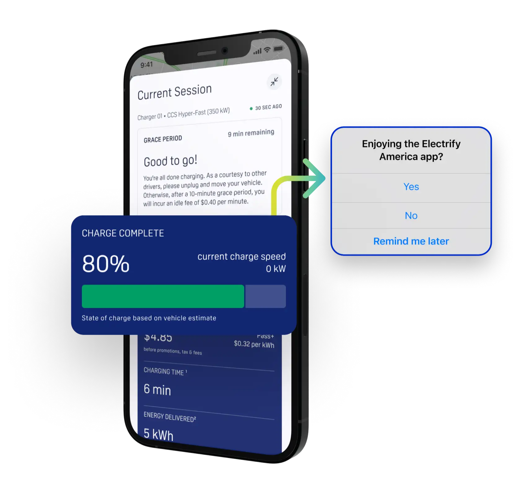
App rating strategy
We had a hypothesis that app reviews were disproportionately reflective of negative experiences. By strategically prompting users to rate the app after successful charging sessions — rather than randomly — we dramatically shifted the composition of reviews.
Phase 02 · HomeStation™
After the app launch, I was lead product designer on the HomeStation feature. HomeStation is Electrify America's smart home charger — and integrating it required working closely with the manufacturer in China to identify the proper steps required for hardware pairing and app syncing, alongside legal review of all copy.
The design challenge was making a complex hardware pairing process feel seamless within the existing app, while surfacing new capabilities that changed how drivers thought about charging entirely.
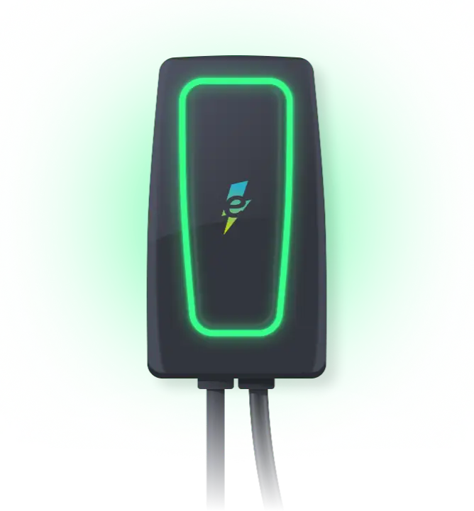
Manage your session remotely
Use the app to start and stop charging from anywhere. Real-time status without being near the charger.
Schedule preferred charging times
Automatically charge overnight or at times when energy costs are lower — off-peak pricing built into the scheduling interface.
Voice control
Control HomeStation via Amazon Alexa and Google Assistant — start, stop, and check charge status hands-free.
Unified account
One app, one membership, one charge history — whether the session happened in your garage or at a highway station.
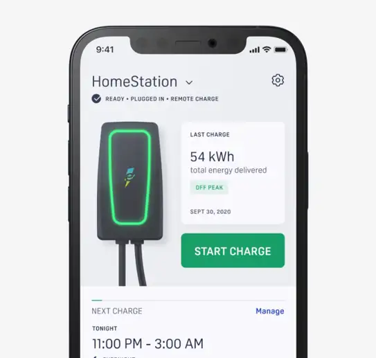
Monitor your charger
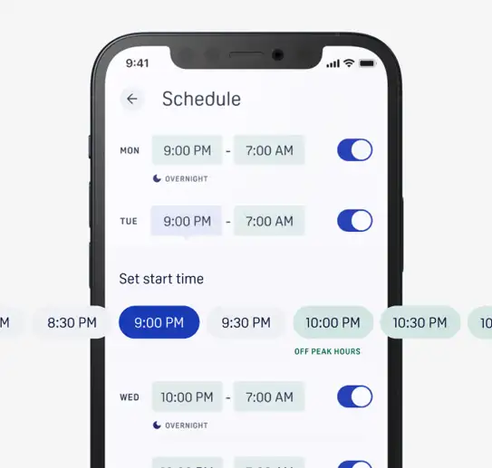
Schedule off-peak charging
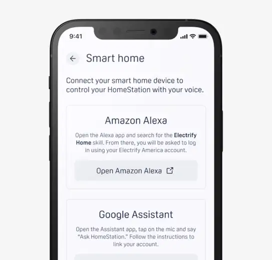
Voice control
Phase 03 · CarPlay & Android Auto
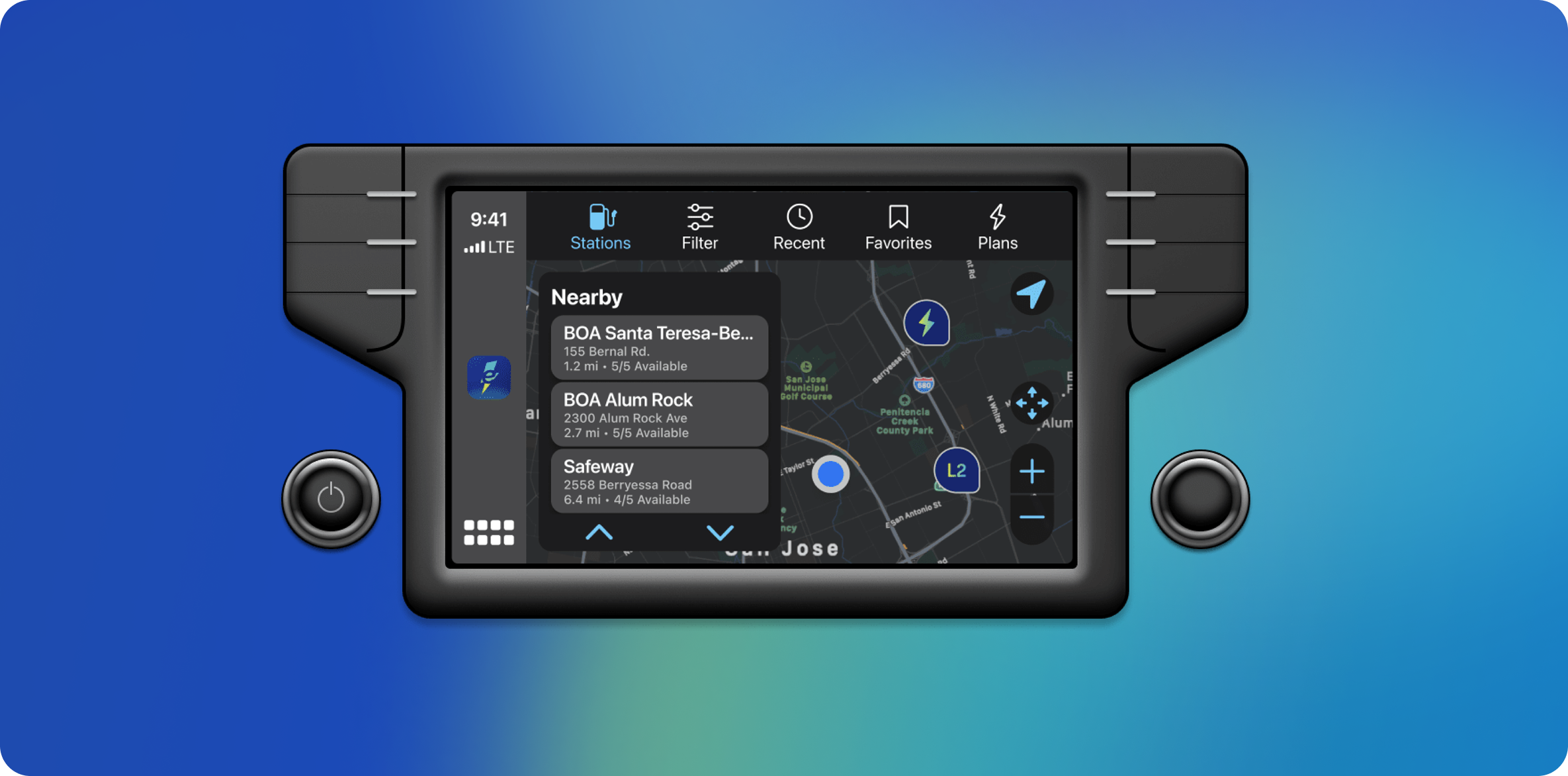
I worked as a solo designer with two engineers (iOS and Android) to design the CarPlay and Android Auto experience from the ground up. This was a new space — one of the first charging networks to build a native in-car experience. The design had to work within Apple and Google's tight platform constraints while maintaining EA's brand and supporting the core use case: a driver on a long trip who needs to find and navigate to a charger without touching their phone.
The result was a station finder optimized for one-handed, glanceable use — real-time availability, compatibility filtering, and the ability to start a charge remotely from the dashboard. Drivers could find, navigate to, and initiate a session without ever unlocking their phone.

Fast Company
Innovation by Design Award — Automotive
Official 2022 Honoree · NYC Award Ceremony

Phase 04 · HMI Redesign
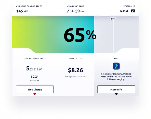
I led the team that redesigned the Human Machine Interface on the chargers themselves — the screen you interact with when you plug in. This required another round of extensive user research: what were the pain points, what would make the experience more intuitive, and how do you test solutions in the field before launch.
With product research, we uncovered new feature opportunities — like showcasing Premium Offer membership plans — that informed an all-new UI. The redesigned screens addressed business goals of increasing app usage and membership signups while solving user pain points: understanding where to tap for payment, knowing charge progress at a glance, and maintaining EA's sleek brand.
Design principle
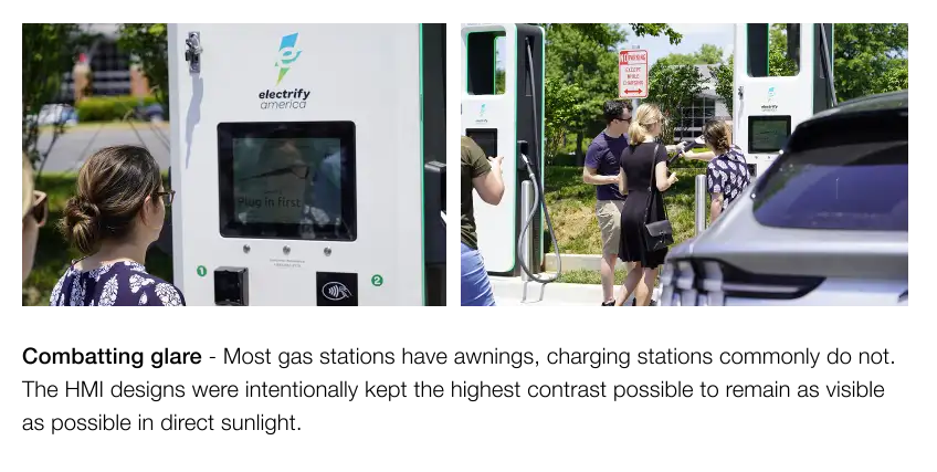
We used the gas station mental model to establish a clear path forward. "Plug in first" — three words that replaced an interface that was asking users to make decisions before they understood what they were deciding.
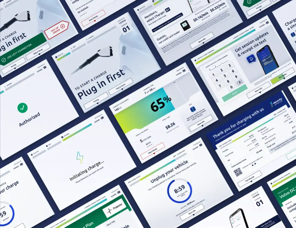
Key design challenge
Most gas stations have awnings. Charging stations commonly do not. HMI designs were intentionally kept at maximum contrast to remain legible in direct sunlight — a constraint that drove every color and typography decision on the charger screen.
Business goals served
Increasing app download and membership conversion at the charger. Showcasing Premium Offer savings. Reducing calls to the support line by making self-service steps explicit and glanceable at every stage of the session.
Phase 05 · Physical Labels & Brand Consistency
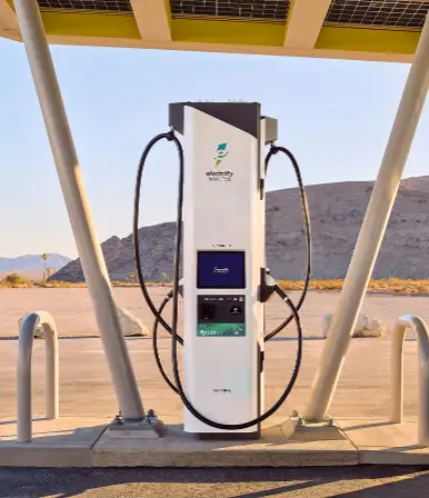
After conducting over 400 extensive user interviews, we helped Electrify America set an industry standard with a network-wide label redesign. The research surfaced consistent, specific pain points that no previous design iteration had addressed at the physical level.
What research uncovered
The solution
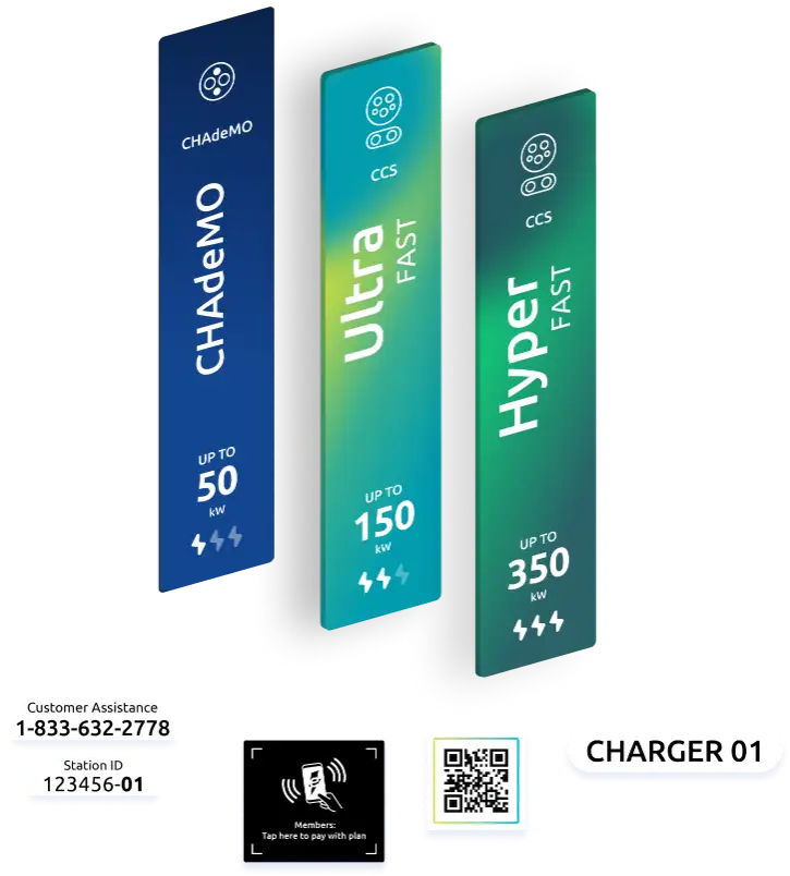
"These stickers help me decide which chargers to use."
EA station user · 4.5 / 5 rating · Strongly agree
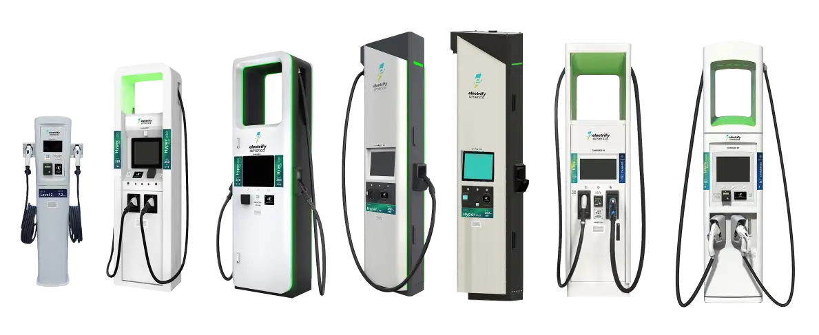
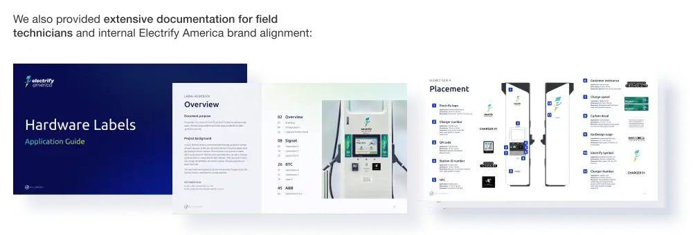
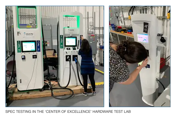
Electrify America's network grew so rapidly that a single hardware manufacturer couldn't keep pace. The network uses six different DC fast charger models and one Level 2 model — seven hardware manufacturers total. We ensured consistent experience across all of them: same labels, same logic, same iconography. This required hands-on partnership with printers, choosing proper materials, and sampling across seven charger models and multiple generations for consistent look and feel in the field. We also provided extensive documentation for field technicians and internal EA brand alignment.
Phase 06 · Nucleus Portal
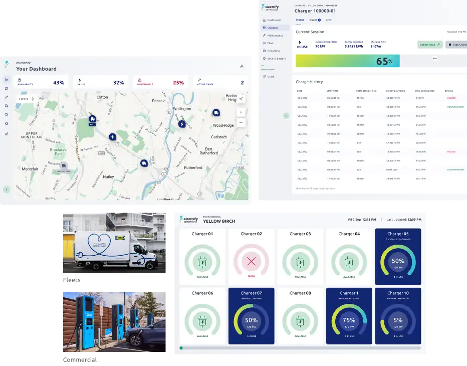
Alongside the label redesign, I led the team that designed Nucleus Portal — a net new product for Electrify America to support fleet operations and partner networks. This management tool helps EA administrators monitor clients and their respective stations with ease. It also enables those clients to monitor their network uptime and utilization, generating and automating custom reports.
The fleet product was designed for commercial partners who charge and manage EV fleets using EA chargers — tracking their network of stations across routes and managing billing. I also supported efforts for white-labeling the app and HMI for OEM network partnerships including Porsche, Maserati, and Jeep (white-labeled apps), and commercial partnerships like Target (white-labeled HMIs).
By this point I had moved into a Design Director role, overseeing all of EA's design system across products and owning their marketing website design — including redesigning how EA supports and educates customers through FAQs, education campaigns, and custom help landing pages for first-time chargers.
Outcomes
The through-line across all six phases: every surface a driver touches — phone, car dashboard, physical charger, parking spot — now tells the same story. That's ecosystem design!
The Team
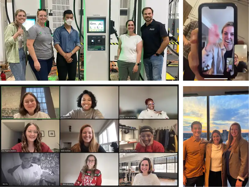
This work spanned three years and 45+ people. None of it — the research rigor, the cross-surface consistency, the award-winning CarPlay experience — would have happened without the full team who showed up for every sprint, every field study, every stakeholder review.